UX Prototyping
Michigan State University, Class Project
About the Project
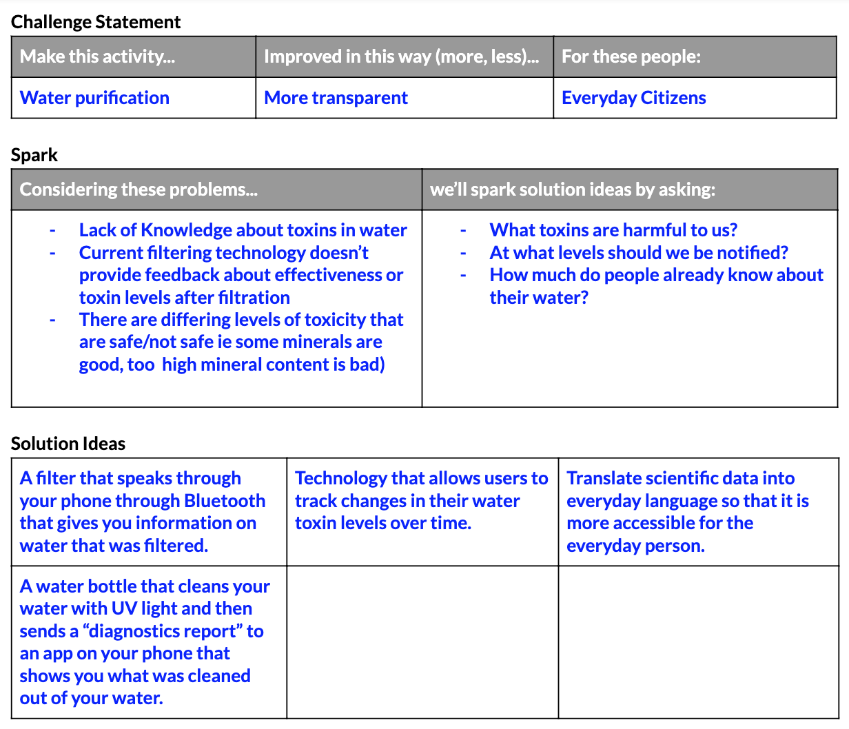
As part of a semester-long prototyping course at Michigan State University, I teamed up with two classmates and took on the challenge to develop an app idea in response to a problem involving water. Inspired by the Flint Water Crisis, we decided to attack water pollution in the Great Lakes, recognizing that safe drinking water is a basic human right. Our challenge statement focused on water quality transparency:
“Design a mobile app that will make general knowledge regarding the safety of drinking water more accessible to everyday citizens.”
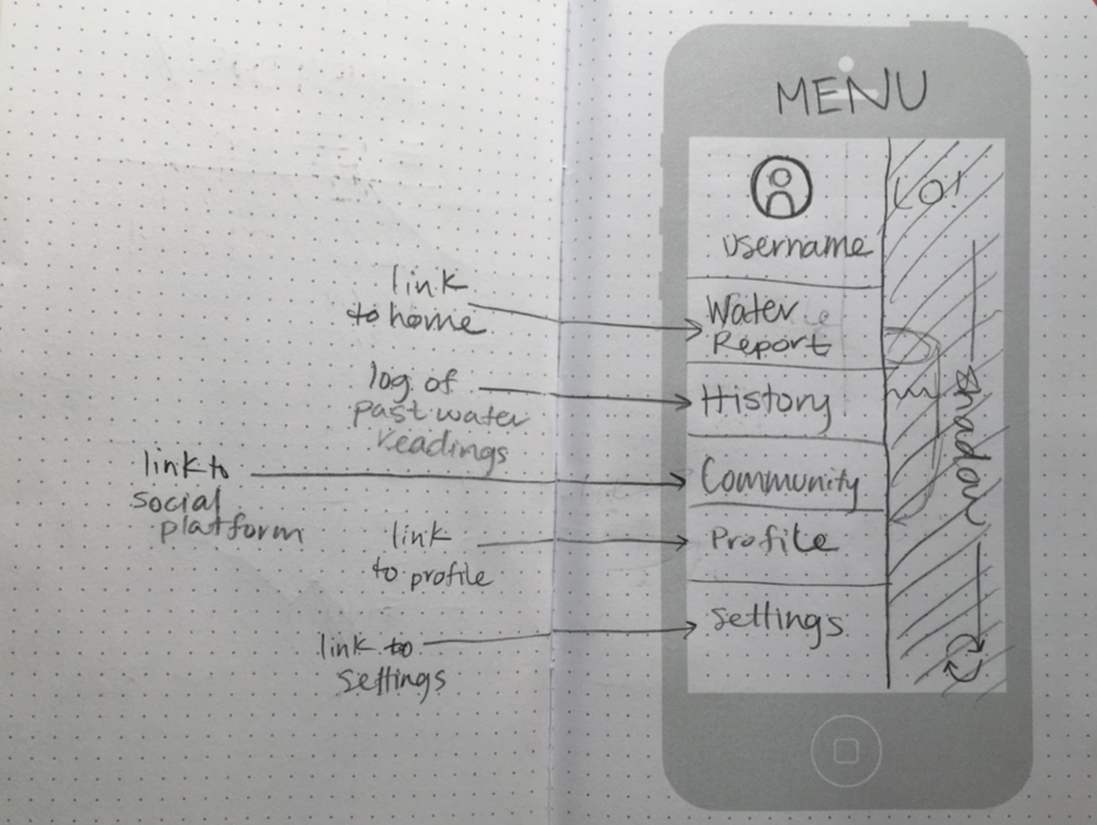
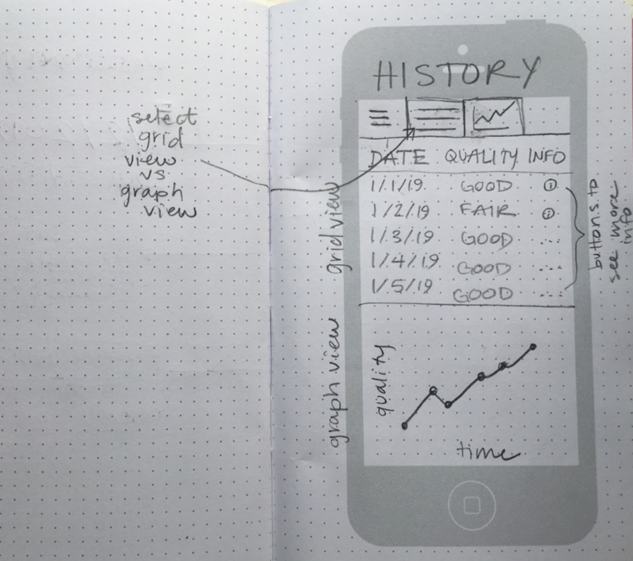
Our Solution: An app called Drip, which syncs wirelessly with water-testing hardware, to deliver accurate and timely data about a person’s water quality. Drip tells the user whether or not the water they test is safe to consume, what chemicals are found in the sample and at what levels, and allows the user to track the history of their water quality, learn more about different chemicals found in water, and receive alerts about water quality concerns.
Tools Used: Google Docs, POP - Prototyping on Paper, Figma
Process
As a team and independently, my teammates and I followed a thorough design process.
Challenge statements and spark frames — As a team, we wrote a series of challenge statements and completed spark frames to hone in on a specific, feasible problem.
User scenarios — To better understand how our app would be used and define the goals of the project, we each wrote user scenarios for our app idea. We outlined major target-user concerns, such as water content, quality, and safety, as well as major target-user goals, like being able to test the water in the home.
User flow diagrams — Before even beginning to sketch ideas, my team and I determined how the application and water-testing hardware would speak to each other, and how the app would gather and use the information.
Maintained an open line of communication for feedback, reflection, and revision throughout
Findings
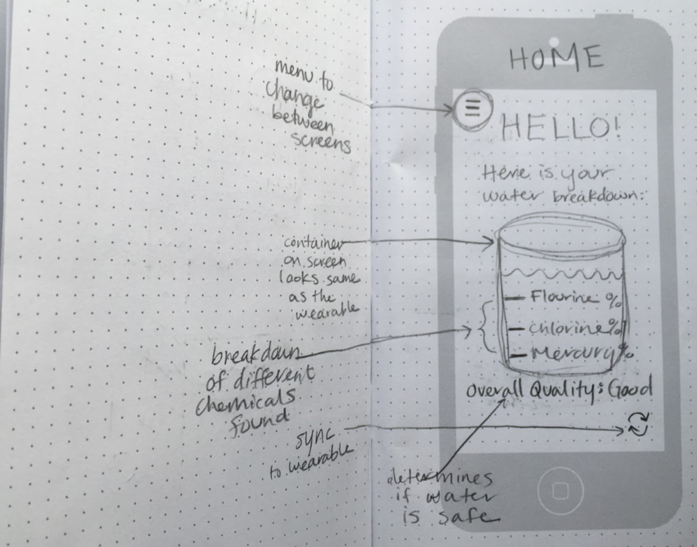
After conducting user testing with my paper prototype, I realized there was much room for improvement, especially concerning how I chose to convey pertinent water data on the Home page. As you can see in my Home screen sketch above, my initial instinct was to provide users with a chemical breakdown of the tested water using percentages. When I put this in front of users, however, I received feedback indicating that the percentage quantifiers were mostly meaningless to them. Aside from the Overall Quality rating below it, there was no way for the user to know if the chemicals found were safe to consume, or approaching unsafe levels. To address this issue, I chose a different way to display water contents, this time using scales. This made it easier for users to see how each chemical percentage contributed to their overall water quality. (See Deliverable below.)
Another fault I uncovered during user testing was that using words like “Good” and “Bad” were not good enough qualifiers to express whether or not the user’s water was safe to drink. Additionally, it became clear that the Overall Quality rating must be designed as a pass/fail binary, since the users wanted to know confidently whether their water was safe for consumption or not. I adjusted the Overall Quality rating to either display “Safe” or “Unsafe” based on whether the chemicals found in the test had reached unsafe levels.
Final Deliverable
Lessons Learned
Feature vs. Function — When delving into my app idea, it was easy to readily list the features I wanted to include. Over the course of the project, I learned to focus more on the functions my app needed to serve to users. Only then was I ready to determine which application features could best help the users meet their goals. Function always informs features.
Áine Dillane © 2024


